Steam Iron Product Photography Best Product Listings Photography Review |
Steam Iron Product Photography– Best Amazon Product Listings Review
In this article, we explore Amazon listings in the steam iron for clothes category to understand what works, what doesn’t, and what visual strategies help products stand out in a highly competitive marketplace.
Our review focuses exclusively on visual presentation—including main images, secondary images, infographics, and A+ content—at the time of review. We are not analyzing keyword strategy, advertising data, historical ranking performance, or backend optimization, as this information is not visible to shoppers during the buying decision.
This article was written on our own initiative as part of our ongoing quest to deepen our understanding of e-commerce visual strategy and the challenges brands face when competing in crowded product markets. We have no ties to Amazon or any of the sellers mentioned - and we don't take any money from any of the brands we review.
Steam irons aren't exactly the most thrilling category of product. Most shoppers already pretty much know what they want from a steam iron - and it's fair to say that innovation isn't exactly what people are looking for here. As a result, when it comes to selling these products, it's the visuals that carry much more weight than most sellers expect. When options are essentially the same in what they do, the pictures are used to convince shoppers that one option offers better value, feels more trustworthy, or is simply more convincing..
I. Main Image Photography for Steam Iron Listings on Amazon
Searching for “steam iron for clothes” on Amazon.com. This is roughly what comes up:
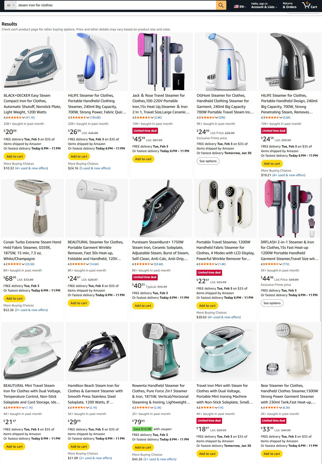
The first thing you notice when you take a gander at this category is just how cluttered the whole thing is. Most of the listings look like they've been photocopied from the same template: a steam iron on a plain white background, slightly angled to show the metal soleplate, steam vents, or handle. And sure, that's exactly what Amazon wants to see - and it does give a clear view of the product, I'll give it that. But all this uniformity just makes it a real chore to tell the different irons apart.
To a shopper, almost every option looks "just fine" at first glance. That's usually the point, incidentally, where shoppers aren't consciously poring over features; they start discarding the ones they're not interested in. And when you're faced with ten irons that all look like they're cut from the same cloth, it's the tiny little details - like how well the lighting is done, whether the proportions look spot on, and what the background looks like that start to make some listings seem way more trustworthy, and others just plain forgettable.
Which means that all those little visual things, like how big the image is, how realistic it looks in practice, and how the seller uses lighting and al,l end up playing a more important role than most sellers probably give them credit for.
Let's take a closer look at two of the listings on this search results page, and you'll see what we mean by this.
II. Top Sellers in Silicone Utensils Set Listings on Amazon
The listings we will review in this article are:
A. BLACK+DECKER Easy Steam Compact Iron for Clothes – Automatic Shutoff, Nonstick Soleplate
B. Hamilton Beach Steam Iron for Clothes – High Velocity Steam, Leak-Proof Design
A. The best-seller in this product category is the "BLACK+DECKER Easy Steam Compact Iron for Clothes – Automatic Shutoff, Nonstick Soleplate"
Stats:
- Pieces in Set: 1 pcs
- List Price: $20.99
- Bought in Past Month: 20K+ units
- Number of Reviews: 41.1K
- Stars: 4.4 out of 5 stars
- Amazon’s Choice: Yes
The BLACK+DECKER iron listing features 10 main images.
This listing immediately signals trust through volume. A high review count and the “Amazon’s Choice” badge do a lot of heavy lifting before shoppers even open the listing.
But what really separates this product is the way the visuals support the message. Compared to Hamilton Beach, BLACK+DECKER leans more heavily into natural, in-use photography. The product is shown in real ironing situations, and the steam looks more believable and less “perfect.”
Functionally, the iron covers all the expected basics. The standout feature is the 3-way auto shutoff, which addresses a very real concern for many buyers: safety. The lightweight build and ergonomic handle also position it as easy to use, especially for shorter ironing sessions.
Overall, BLACK+DECKER’s listing feels more grounded. It builds confidence by showing the product behaving like a real household tool, rather than relying mainly on polished graphics.
Most shoppers don’t analyze images one by one. They skim. They scroll fast. And they only stop when something feels either unusually clear or unusually suspicious.
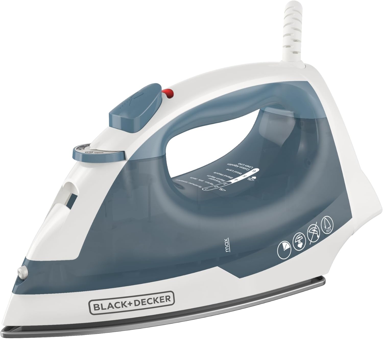
1. The BLACK+DECKER listing feels more grounded and believable almost immediately with a main image that is clean and polished, but still looks real.
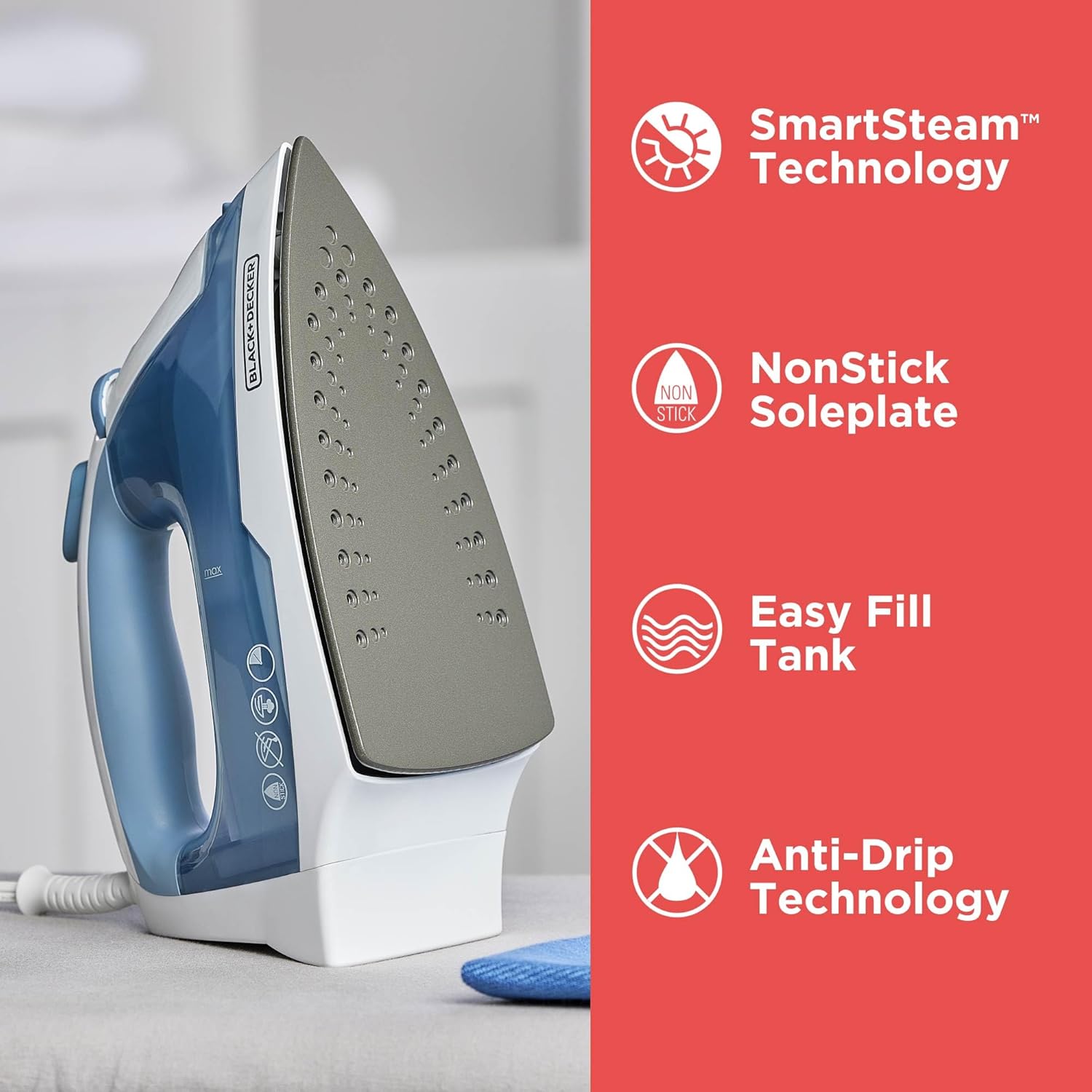
2. The first image after the main is an infographics that highlights the main selling points of the steam iron. This infographic image works perfectly well as a quick summary. A shopper can understand the main features in seconds, without digging into the bullet points. Three main selling points, no fluff, red background of white text. Simple and clear.
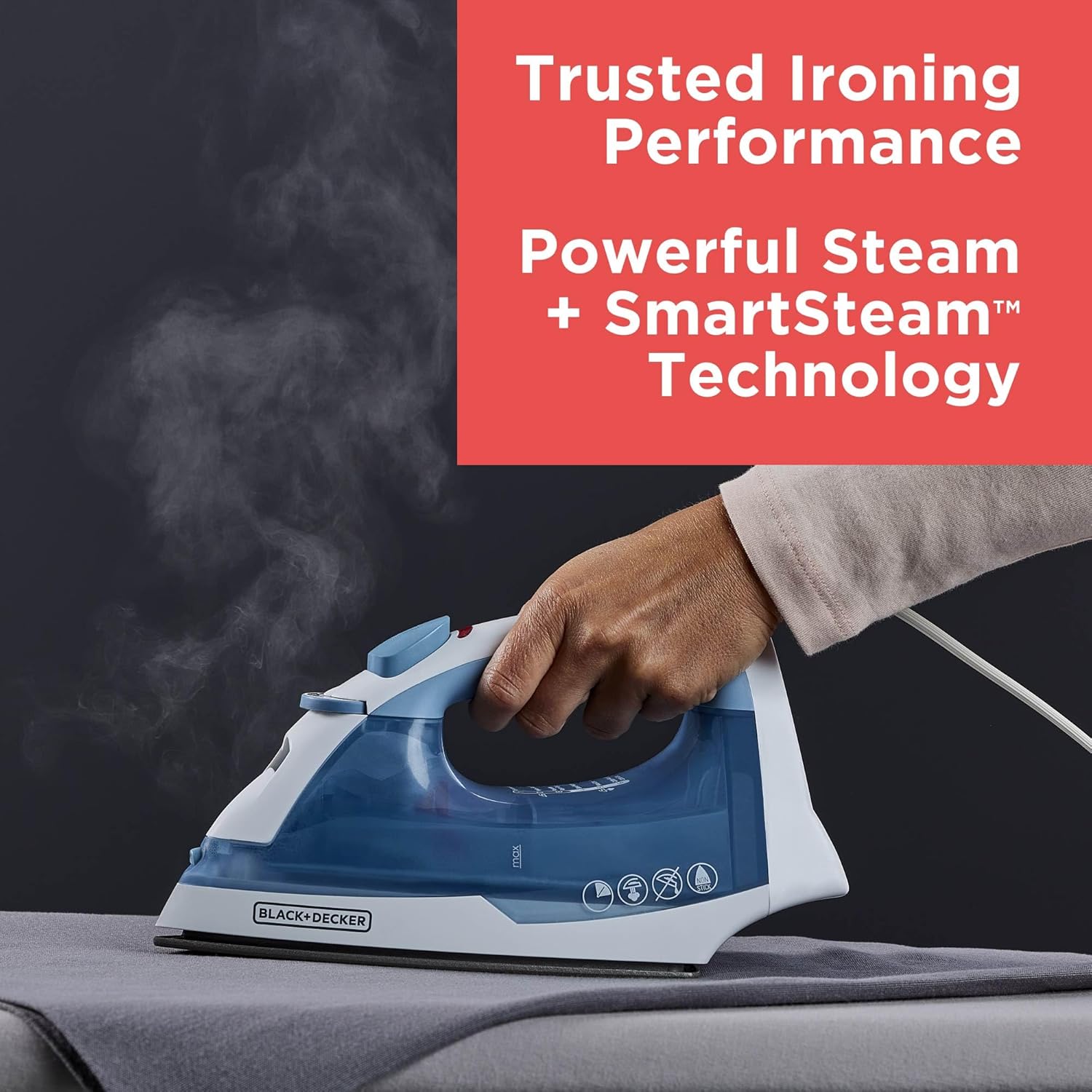
3. Next comes a very powerful lifestyle photo of the steam iron in use that illustrates the functionality very clearly. This lifestyle product photo is a real image of the steam iron in use, it is not overly stylized or artificially exaggerated. The product is clearly visible, with the ware storage compartment fully visible, the item that is being ironed is perfectly ironed, the steam looks powerful against the dark grey backdrop and the text overlay is again in your face and to the point.
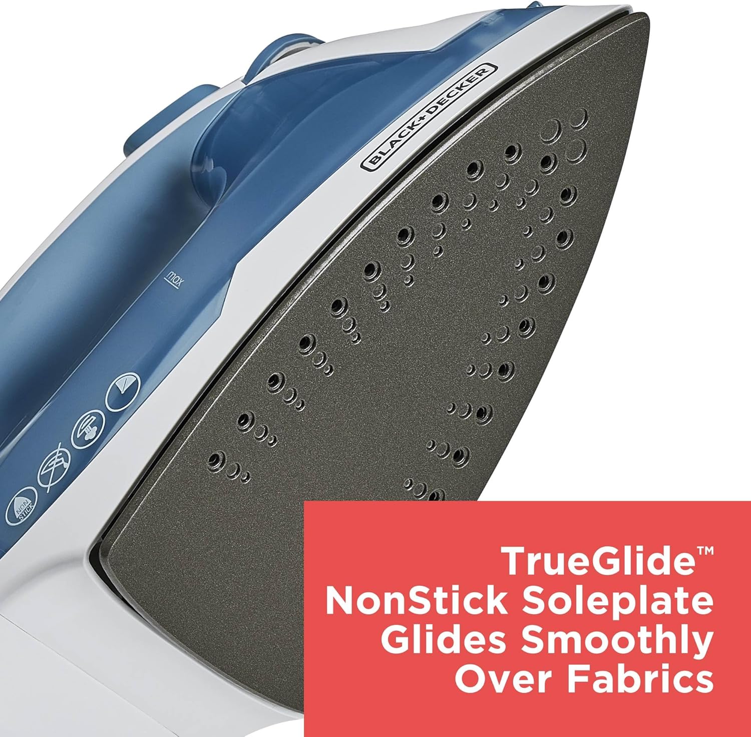
4. The fourth image is a detail product photo of the soleplate of the steam iron. The image is clear and the lighting shows the texture and composition of the soleplate along with text overlay that explains the benefits of the design. Some graphic designers might frown at the over-simplified infographics style with basic text in a red rectangle, but clearly it works for this brand.
4. 5.
5.
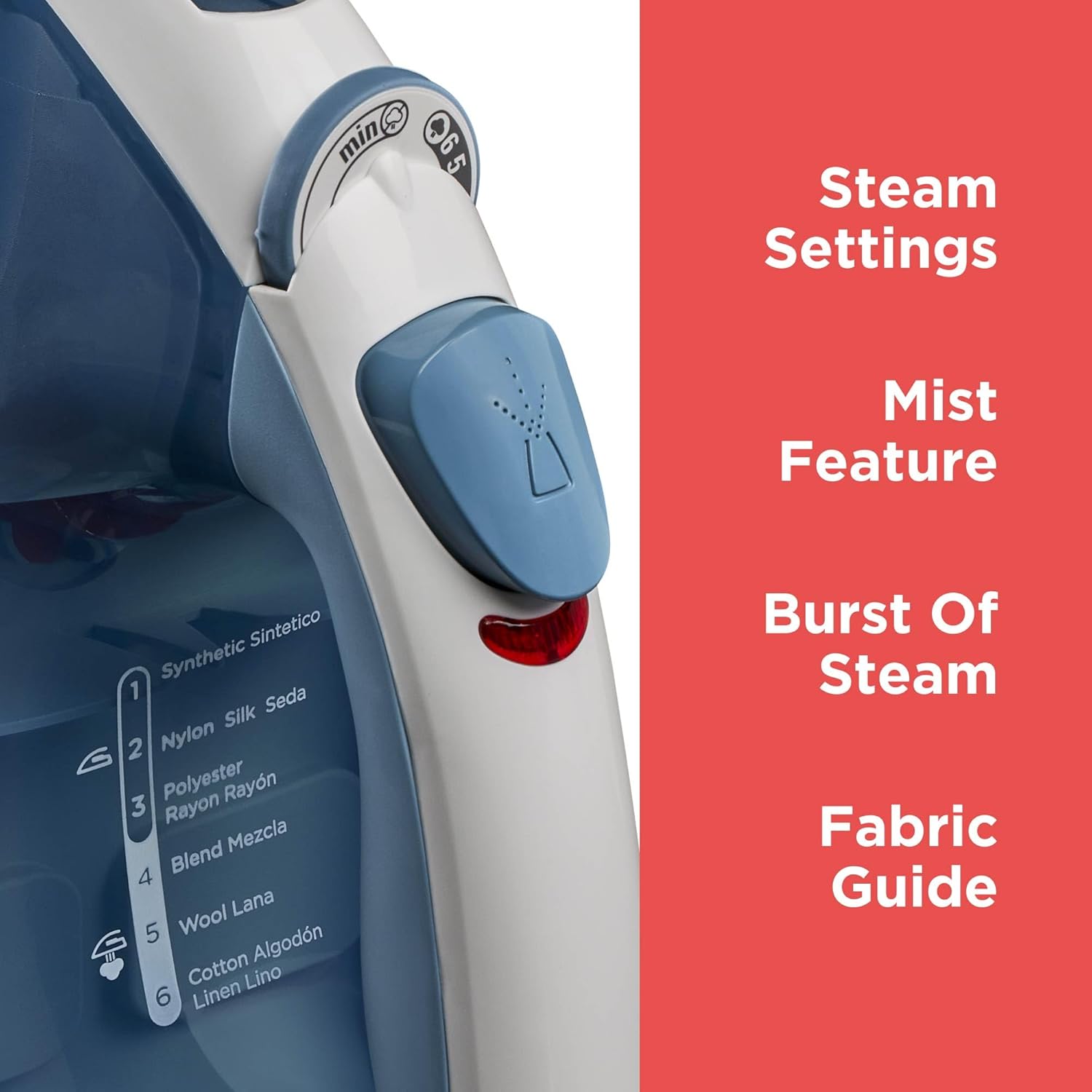
5. The fifth image is a close-up photo of the steam control buttons. The angle of the image highlights how conveniently placed the fabric guide is right under the handle so it is easy to see during ironing with a dial for the strength of the seam and a button for the mist. The text in the overlay explains the same features. This detail image is technically very well executed, everything is on focus and clear. This kind of photo would have to something mentioned in the photography brief, because it is a feature that may easily be missed by a photographer, but one that is very interesting and definitely worth mentioning as a selling point. Clients sometimes make the mistake of assuming that photographers will figure out key features of the product on their own, but more often than not, there is no time for that, so the more clearly you explain what the product is and what need to be highlighter in the product photos, the higher the likelihood of getting images that help you sell more will be.
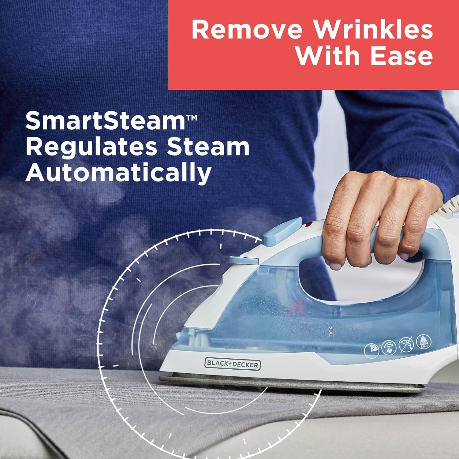
6.The sixth main image in Amazon in another lifestyle photo of the steam iron in use, showing the automated steam regulation feature of the product. Something interesting to notice in this photos is the way the hand is holding the stem iron, it is very effortless. A small detail in a lifestyle product photo like this really contributes to the impression that the steam iron is effortless to us.
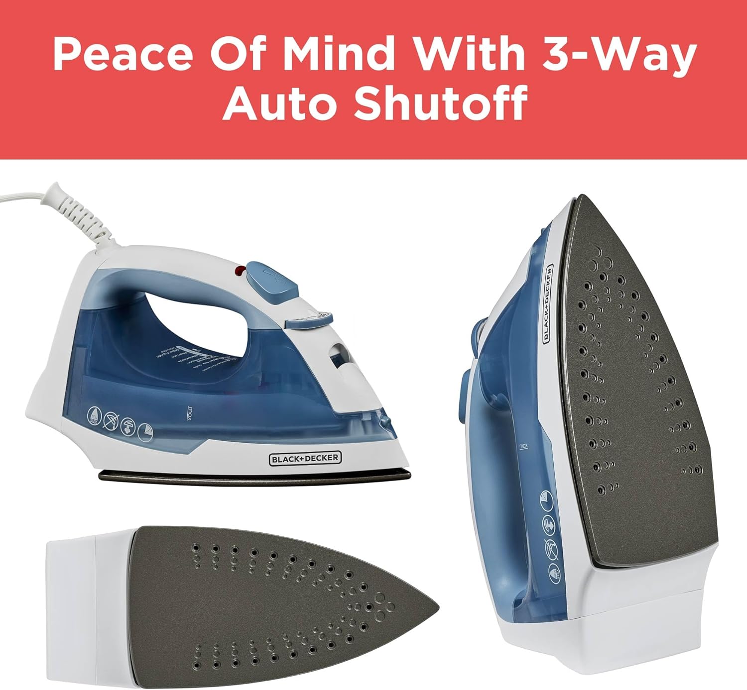
7. Next we see an amazon product infographic that shows the auto shutoff feature of the product. The graphic design itself is very basic, yet impactful, because it immediately communicates what the feature is with 3 images and one title only..
Safety is one of those things shoppers care about deeply and it is a huge selling point for this product that needs to be communicated.
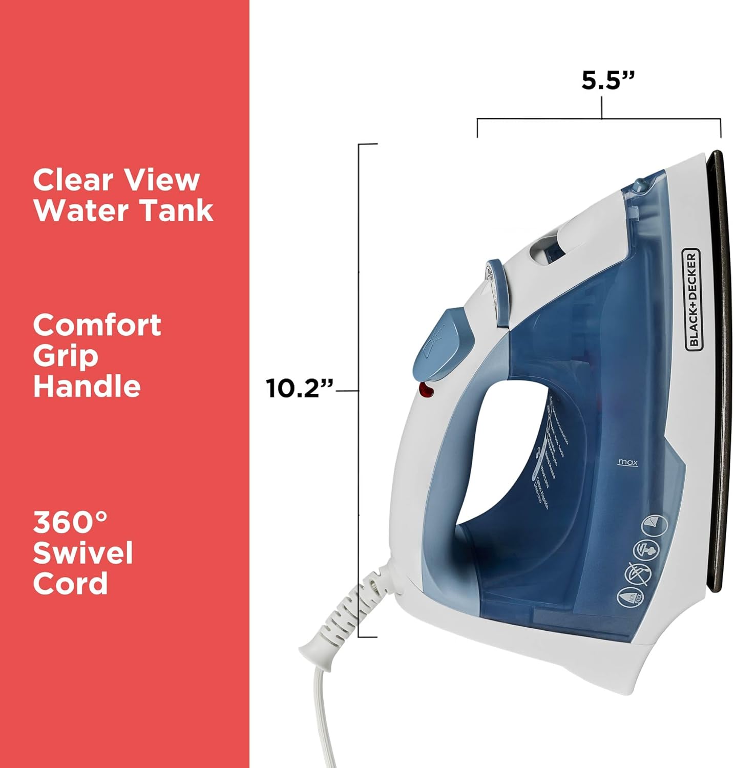
8. The eight main image in the listing is amazon infographic that shows the dimensions of the product. It is important to always include a dimensions infographic, because it is not always immediately apparent, even from lifestyle images how big the product is. It only takes a little bit of time for your in-house graphic designer or a few extra dollars to your hired amazon infographics design service do an infographic like this and the ROI is very high in comparison.
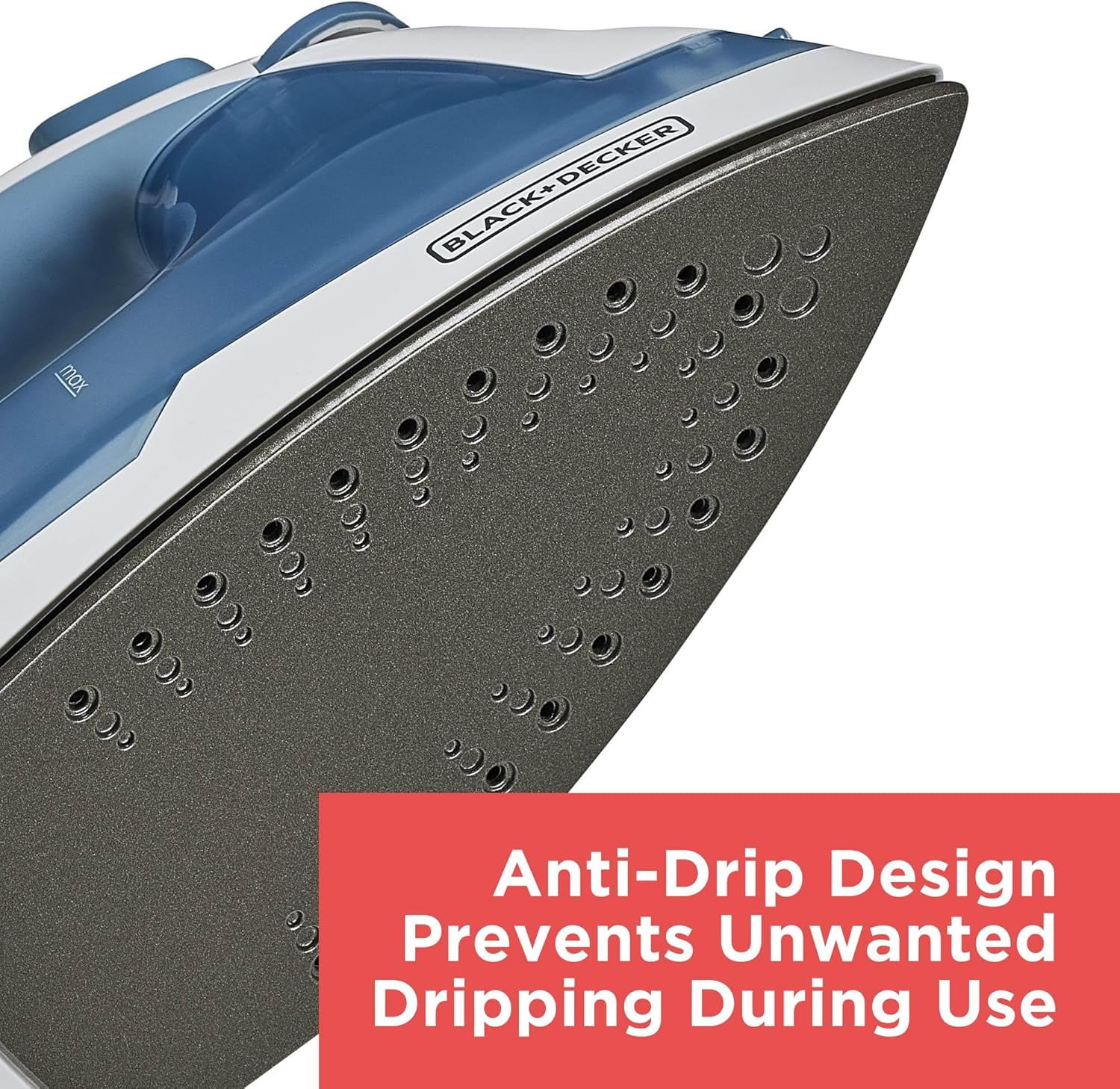
9. The ninth product infographic is similar to image 3, with different text, showcasing the anti-drip design of the steam iron.

10. The last amazon listing photo is a lifestyle image of a young woman ironing a shirt and the text of the infographic lists items for which the steam iron is suitable.
Product Video. This product listing does not have a seller uploaded video.
Verdict: This steam iron product listing does a great job at focusing on what is important, and this is communicating clearly the selling points in realistic-looking product photos that are clean and polished. The lifestyle images look like they were created with the assistance of AI, but they look real enough and are not distractingly fake, which is something that would impact the buying decision negatively. The listing images are not the cheapest option, but they are not top production quality and complexity either. With us the production of infographic design and photography would have cost around US$200 (this does not include the creative direction for the listing, only the production).
In a category like steam irons, that realism matters more than people think. Buyers aren’t looking for visual perfection here. They want to feel confident that the iron will work the way it’s supposed to.
.
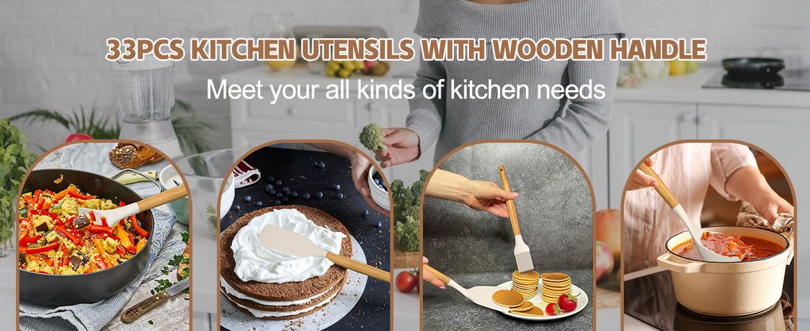
B. The next listing we will review is "Umite Chef Kitchen Cooking Utensils Set, 33 pcs Non-Stick Silicone Cooking Kitchen Utensils Spatula Set with Holder, Wooden Handle Silicone Kitchen Gadgets Utensil Set (Khaki) "
Stats:
- Pieces in Set: 33 pcs
- List Price: $32.99 ($0.99/piece)
- Date First Available: February 26, 2020
- Bought in Past Month: 7K units
- Number of Reviews: 27.8K (this number changed to 28.6K in the week I was writing this article)
1. The main image for this product is a lot busier than the previous listing we looked at. I would go as far as say that in terms of creativity the image blends into the search results and listing image itself doesn't really attract a click. The photo still does a good job of presenting of what the set includes and the post-production quality is very good, the seller ordered more than basic retouch and it shows in the cleanliness of the image.
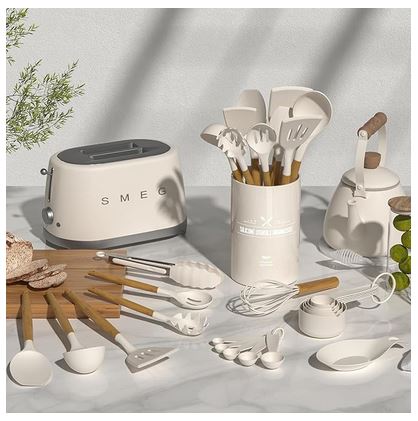
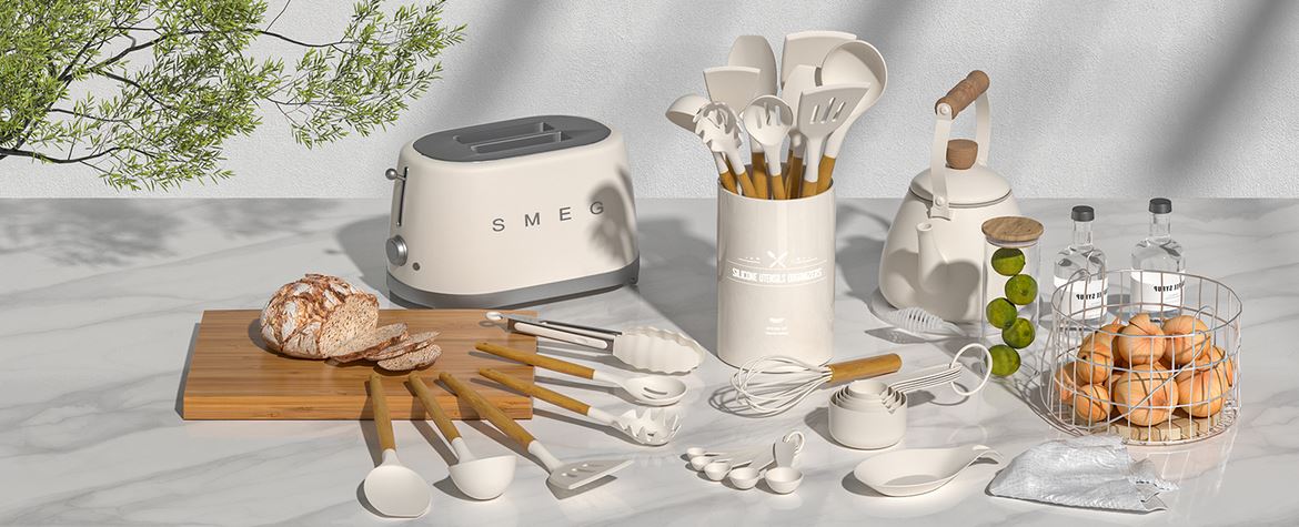
2. The next product photo shows the whole set laid-out on a tabletop with a few minimal props, but one of these props is very interesting. You will notice the Smeg toaster. Technically, I believe the seller needs to retouch out the Smeg logo and not show it, but no one has made a problem with the listing, so they are using the prop to associate their product with a high-end brand, implying that their products are also high-end. Actually, without the toaster, I would say the photo is not great, the individual items are not very visible at this angle and the colors don't make the product pop-out. In fact the main thing I focus on looking at the image is the toaster. I guess this was the aim.
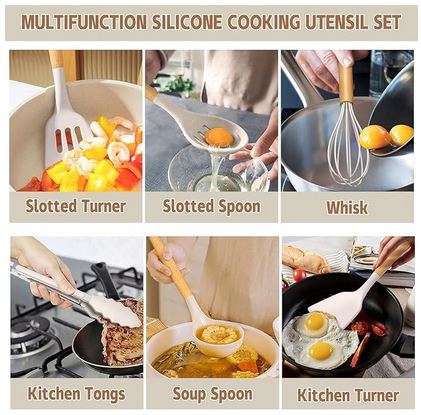
3. The third main image box image shows six scenarios where the utensils can be used. Since there are 33 pieces, only a few of the pieces can be highlighted and the seller has done this here, placing 6 utensils together into one infographic. The images are basic close-ups showing fix of the spatulas.
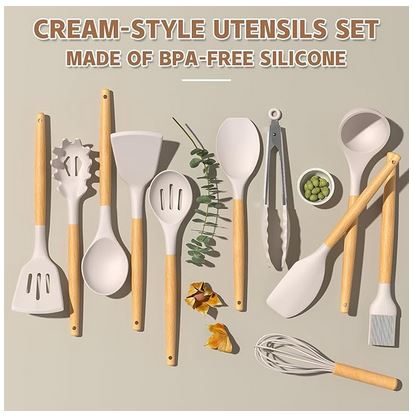
4. The forth of the main images in this Amazon product listing is a flatlay still life image of the main spatulas in an abstract setting with a few rather random props and text describing the material.
4.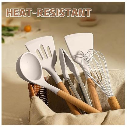
5. Next we see an image of utensils in a basket with the title that says "Heat Resistant". There is nothing in the image suggesting that the items are heat-resistance, and how hear-resistant they are.
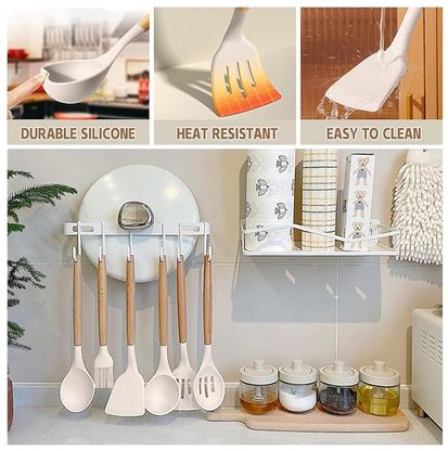
6.Next we see three selling points fit together in one infographic with text saying "durable silicone", “heat resistant", "easy to clean". This is 3 images occupying the top 1/3 of the image and in the bottom we find an image of 3 of the utensils hung on a rather strange hanging stand.
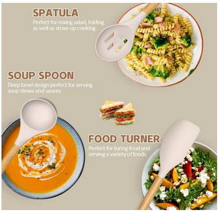
7. The last image is a cutout assembly of three utensils photoshopped over images of soup, salad and cooked pasta. The image looks very fake.
Let's Move on to Review the A+ Content Photography
1 This landscape of an infographic we saw before. The focus is still largely on the toaster and the props are quite random. The image is also quite confusing, because it seems to include more items than what is actually included in the set, and there is nowhere that lists and labels every item. That point definitely is a block, because not everyone will contact sales support to ask, most people will just move on to the next listing.
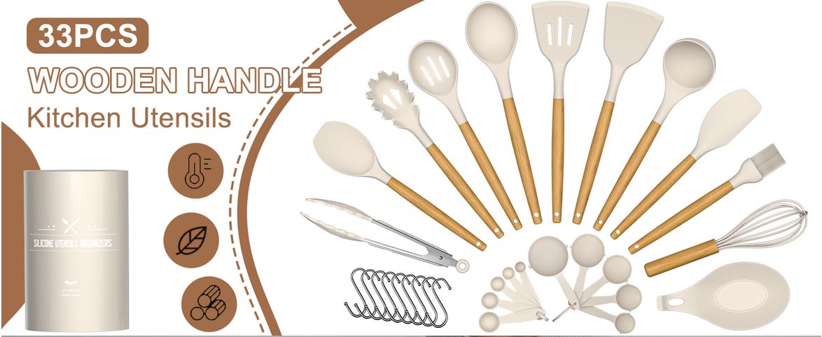
2 This version shows of the infographic seems to show all the things included in the set. Personally, I am still confused what the 33 pieces are. I counted everything in the above images and it looks like that hook things are counted for one piece each. The header of the infographic says "33 Pcs Wooden Handle Kitchen Utensils", which is misleading. Even if we agree that there are 33 pieces in this set, it is definitely not true that these pieces have wooden handles. Only 10 pcs have wooden utensils.
3 In this infographic we have the misleading header again. It is somewhat interesting that this doesn't feature in any of the main image infographics, but is present in 2 infographics in the A+ content. Generally, we advise against misleading text or text that can be interpreted to be something that the product is not.
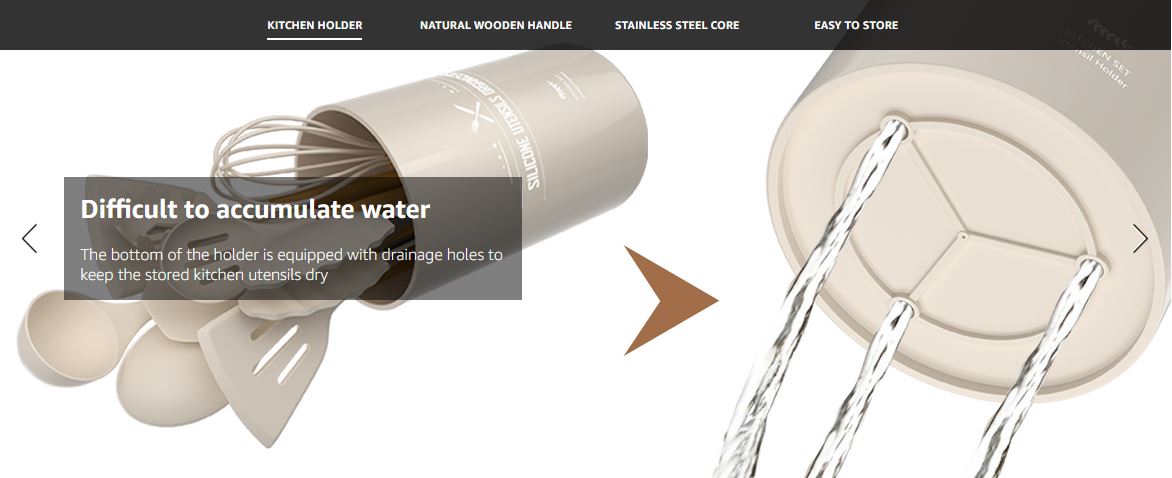
4 Next we have a features A+ infographic about the holes of that holder.
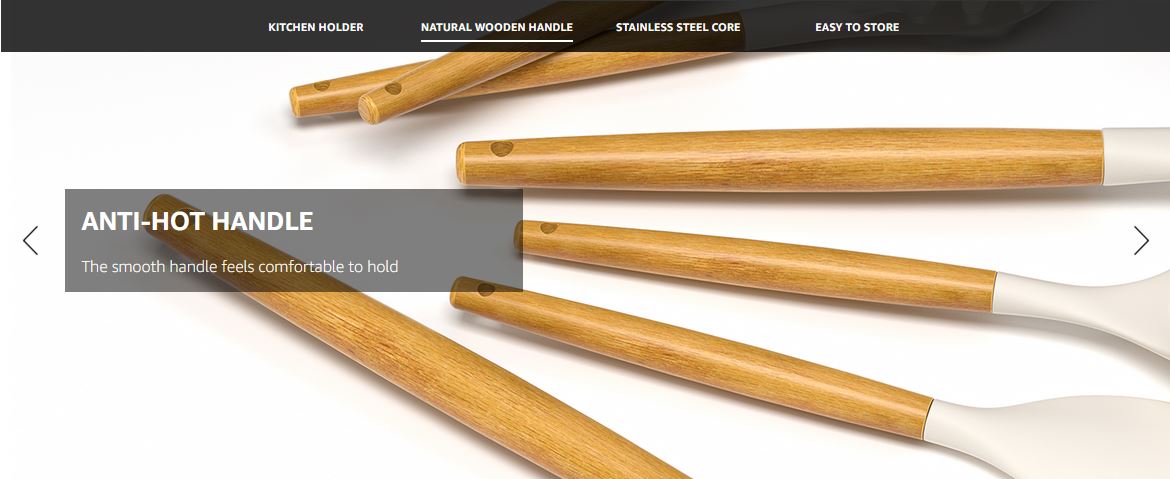
5. Then we see a photo showing wooden handles that are "anti-hot", which is a bit of an off choice of words. I would think the benefit of wood is that it is comfortable to handle, kitchen utensils that get hot while cooking are quite rare, especially those that have silicone heads.
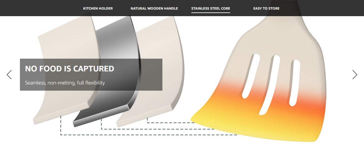
6 In this infographic, the seller tried to illustrate that there is stainless steel core and highlight that the silicone is heat resistant. I would say this is not a very high impact image. Both points get a little lost.
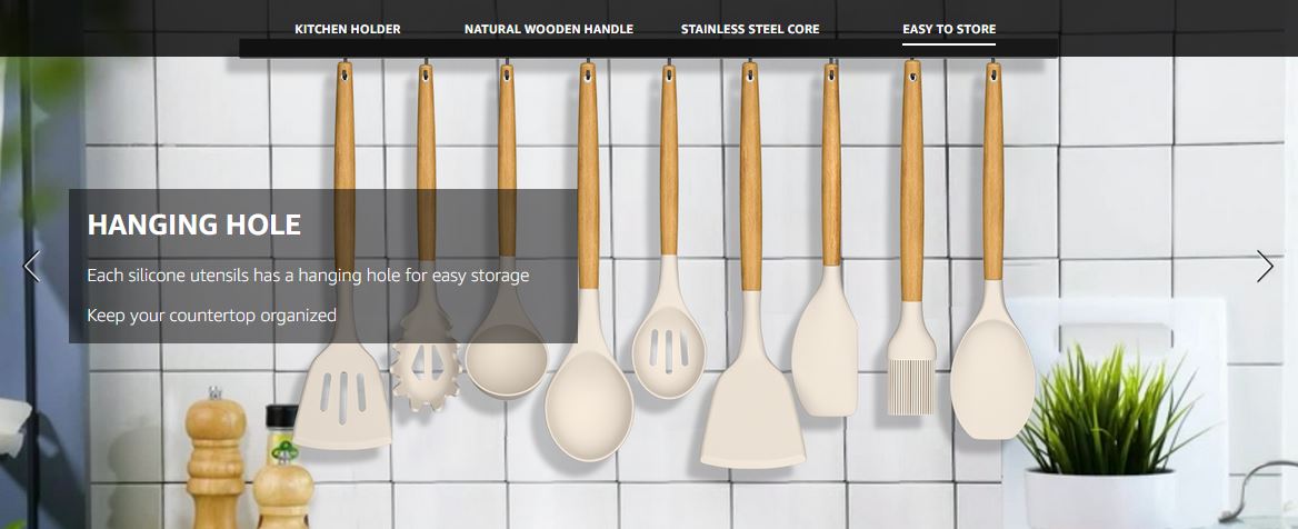
7 Lastly we have "Hanging Hole", without any special features, just hanging hole that makes the product easy to store, allegedly. The backdrop is also a very fake looking image with props that don't contribute anything to the a
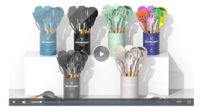
Product Video. This product listing does have a video, which features a showcase of all colors and someone using the utensils to prepare pasta, pasta sauce, steak, and something I can't identify. This video production clearly shows the utensils, the food styling is very basic, but it shows the versatility of the set.
Verdict: This listing is quite messy. The main image draws attention with its clear post-production, but in the following images the key selling points of the product are not presented well at all. This looks like not much time was spent on concept development, probably a very basic brief was given to the product photography company expecting them to create the concept, but they wouldn't have had time to do that free of charge, and they just took some images that show some features in a basic way.
These 2 listings are quite different. The first listing has a lot more thought and preparation put into it and it is not surprising that the amount of sales they make per month is almost 3 times as many as the nearest competitor. The second listing looks OK at first glance, but it has a lot of missed opportunities and small things that would make buyers leave the listing without buying. If this is a product type you are looking to compete with, think carefully about the selling points and what makes you product stand out, instead of just blindly copying other listings images.